A truck is not just a tool for work, but also a mobile advertising surface that is seen by thousands of people daily. Yet, most transportation companies fail to take advantage of this opportunity: they stick a simple decal and think that's enough for brand building. When designing emblems, attention must be paid to readable typography, visual hierarchy, vehicle shape, and contrasting colors, as these factors determine whether the graphics on the vehicle represent actual marketing value or merely "blend in" with the traffic noise. This article helps to understand the true meaning of emblem design, how to do it well, and why it is worth taking seriously.
Table of Contents
- The Meaning of Truck Branding: Concepts and Principles
- Design Principles and Practical Tips: Legibility, Visual Hierarchy, Colors
- Practical Implementation: Types of Branding and Workflow Steps
- Marketing and Branding Advantages: What Does Good Branding Bring?
- What Most People Misunderstand About Truck Branding
- If You Want Real, Durable Branding: Solutions From Us
- Frequently Asked Questions
Key Takeaways
| Point | Details |
|---|---|
| Readable Typography | Designing a logo clearly visible from at least 10-15 meters is mandatory. |
| Visual Hierarchy | The order of logo, message, and contact aids brand recognition. |
| Wrapping or Decal | Full wrapping is more premium, durable, and effective than partial decals. |
| Mistakes to Avoid | Small details, disproportionate layout, poor contrast reduce marketing effectiveness. |
| Branding Benefits | Well-executed branding strengthens brand identity, increases trust, and improves customer acquisition efficiency. |
The Meaning of Truck Branding: Concepts and Principles
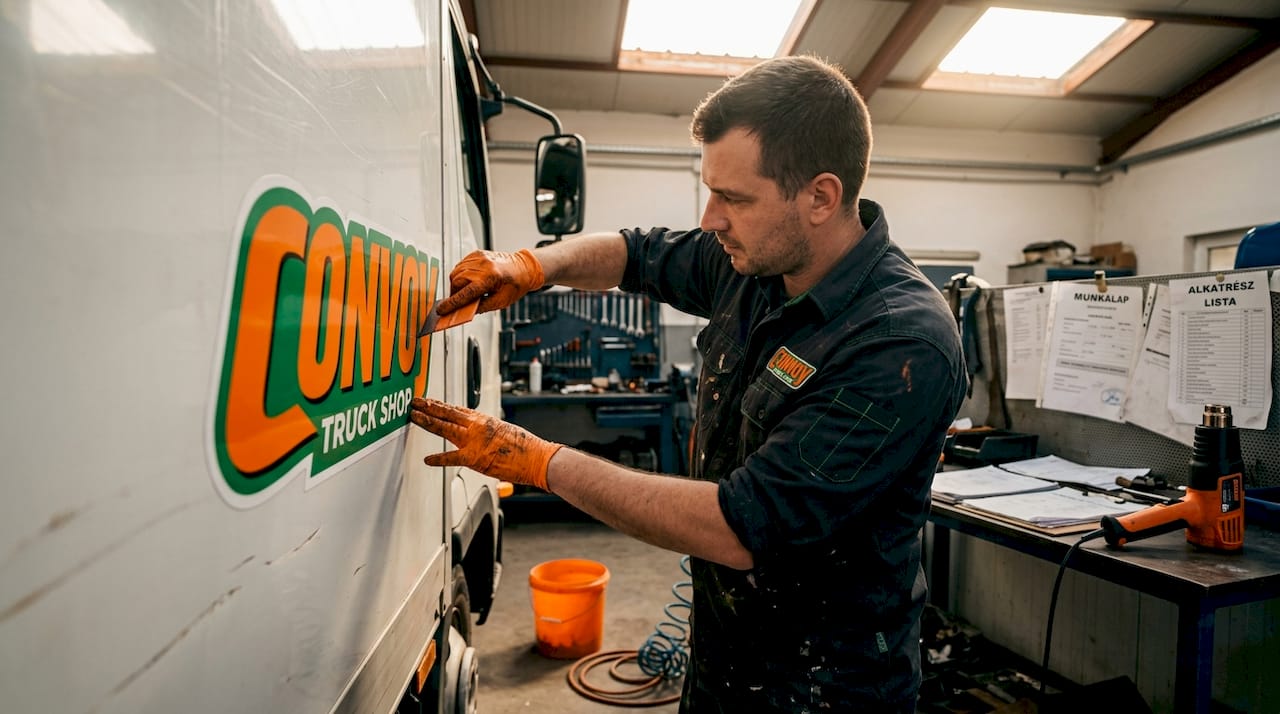
Many people conflate the concepts of emblem, decal, and full wrap, even though these are distinct solutions with different marketing impacts and execution requirements. An emblem primarily represents the visual identifier of a brand: a combination of logo, color, font, and message that distinguishes the company from its competitors. Personalizing emblems is one of the most effective ways to create a unique image and means much more than simply sticking something on the bodywork.
A decal is the most common and widespread solution: graphics printed on vinyl or self-adhesive film, applied to the vehicle's surface. It's a simple, quick, and inexpensive solution, but it has significant limitations. Full wrapping, on the other hand, means a professionally designed and applied graphic covering the entire surface of the vehicle, providing a more premium look and more durable results.
Why does this difference matter in daily practice? Because fleet branding is a serious strategic decision, not just an aesthetic matter. Poor branding not only means wasted money but can actively harm the company's reputation if the graphics are illegible, disproportionately small, or appear messy.
When designing branding, it is worth keeping a few basic principles in mind:
- Simplicity: The vehicle is in motion, and the viewer has seconds to absorb the message.
- Legibility: All text must be understandable from a distance of 10-15 meters.
- Proportionality: The logo and text must be proportionate to the vehicle's size.
- Consistency: The branding must align with the company's other brand elements.
The business advantages of branding are best realized when branding is treated as a unified system, not a one-time intervention, in corporate visuals.
When designing, avoid small details due to printing limitations, and full wrapping is more premium than a partial decal solution. This is critical because what looks detailed on paper can become an illegible mess when printed large and on a moving vehicle. The role of safety emblems is also an important aspect: well-designed graphics are not just advertising but can also contribute to clear identification in traffic.
Design Principles and Practical Tips: Legibility, Visual Hierarchy, Colors
Even the best design intentions are lost if the basic principles are not followed. According to design best practices, readable typography, visual hierarchy, correct proportions, and contrasting colors are the factors that determine whether branding works in reality.
Legibility: The lettering on the emblem must be sized so that it is clearly visible from at least 10-15 meters away. In most cases, this means the letter height must be a minimum of 8-10 cm after actual application. Thin, decorative fonts, unshaded texts, and complex ligatures all impair legibility.
Visual Hierarchy: This means that the viewer's eye should follow the elements in the exact order the designer intends. The ideal order: logo (primary element), company name or message (secondary element), contact information or slogan (tertiary element). If this order is not followed, all elements speak at an equal "volume," and the viewer cannot focus.
Adaptation to Vehicle Shape: A truck is not a flat surface. Doors, curves, edges, sills, and the side wall structure all influence how the finished graphics look. The designer's task is to anticipate where seams and breaks are and adapt the emblem accordingly. The vinyl emblem workflow shows this process step-by-step.
Summary of design mistakes to avoid:
- Small details and fine lines that disappear in print.
- Too much information on a single surface.
- Poor contrast between the logo and the vehicle's base color.
- Disproportionate elements: huge text and a tiny logo next to each other.
- Mixing too many different fonts in one design.
| Design Element | Correct Approach | Mistake to Avoid |
|---|---|---|
| Font Size | Min. 8-10 cm applied | Tiny, hard-to-read text |
| Font Type | Strong, legible sans-serif | Decorative, thin-lined font |
| Colors | Contrasting, max. 2-3 colors | Similar shades, low contrast |
| Logo Details | Simple, scalable graphic | Fine details, shadows, textures |
| Layout | Based on visual hierarchy | All elements equal size |
Pro tip: Before anything goes to print, request a digital mockup based on the actual vehicle's scale. Many designers only work with general templates, but the real vehicle's curves and seams can yield completely different results. If you don't see the design at 1:1 scale on the actual vehicle, you cannot judge if it works.
The choice of visual elements also affects how we perceive the emblem as a whole. Color is a particularly critical factor: an orange-black combination, for example, provides extremely strong contrast, while dark blue text on a gray background often gets lost in traffic.
Practical Implementation: Types of Branding and Workflow Steps
After theory comes reality: how does truck branding actually work in practice? What types should be known, and what steps are involved from design to the finished, applied graphics?
Main types of branding:
- Vinyl Decal: The most common solution, cut self-adhesive film in custom sizes and shapes. Inexpensive, fast, but its durability is limited, and partial coverage gives a less premium look.
- Full Wrap: Digitally printed graphics covering the entire exterior surface of the vehicle. More expensive, but long-lasting, with a strong visual impact, and protects the original paintwork.
- Partial Wrap: Covers certain parts of the vehicle (side panels, doors, roof). A compromise between cost and impact.
- Engraving: Primarily used on smaller metal elements (badges, pins), durable and premium-looking.
- Direct Digital Printing on Surface: Special technology that directly applies graphic elements to certain materials without an intermediate decal.
The branding workflow step-by-step:
- Briefing and Goal Definition: What is the purpose of the branding? Fleet standardization, new brand identity, or refreshing an existing image?
- Design: Defining logo, colors, typography, and layout customized to the vehicle's scale.
- Mockup and Approval: Digital preview on an actual vehicle photo, possibly 3D visualization.
- Printing: On premium quality vinyl film, with UV-resistant ink, for long durability.
- Surface Preparation: Thorough cleaning and degreasing of the vehicle's surface. This is the most frequently omitted and most fault-causing step.
- Application: By skilled professionals, without air bubbles or wrinkles.
- Inspection and Post-treatment: Examination of the finished work, with minor corrections if necessary.
| Type of Branding | Average Lifespan | Price Level | Marketing Impact |
|---|---|---|---|
| Simple Vinyl Decal | 2-3 years | Low | Medium |
| Partial Wrap | 4-6 years | Medium | High |
| Full Wrap | 5-8 years | High | Outstanding |
| Engraved Badge | 10+ years | High | Premium, limited area |
The limitations of small details become truly critical during printing: what appears sharp and detailed in a vector design file can become blurred in large-format printing if the original graphics are not of sufficient resolution or their details are finer than 2-3 mm. Therefore, the logo should always be provided to the executor in a vector source format (e.g., AI, EPS, SVG).
Pro tip: If branding is done after bodywork repair, make sure the new paint layer is completely dry and cured. Film does not adhere properly to fresh paint, and the entire job could be ruined in a few weeks.
Adapting to the vehicle's shape, illustrated with a specific example: on the side box of a semi-trailer, the door seams divide the surface into two parts. If the logo is designed exactly over the seam, it appears divided. The solution is to place the logo further away from the seam, or consciously "bridge" it with a background element that creates a unified visual whole.
Marketing and Branding Advantages: What Does Good Branding Bring?
A truck doesn't stay in a garage. It is seen by countless people daily on roads, in parking lots, in front of warehouses, in cities, and on highways. This visibility provides free advertising space that no other marketing channel can replicate with the same effectiveness.
Why is well-designed branding a strong marketing tool?
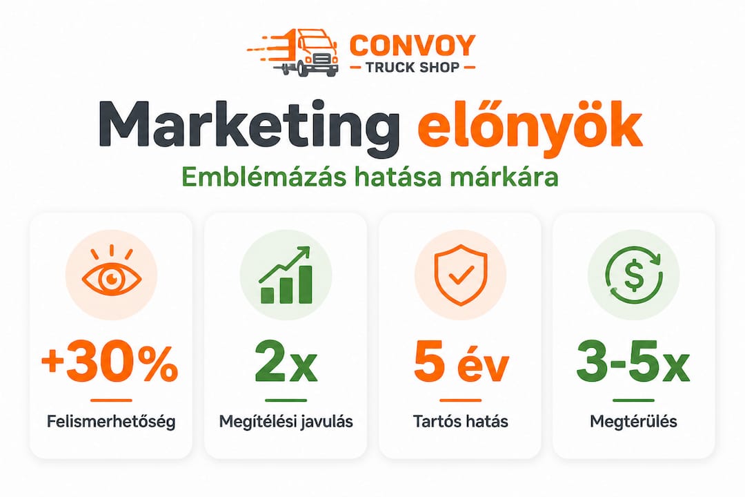
- Passive Advertising: The vehicle communicates even when it is stationary or parked. Up to 30,000-70,000 people can see it in a single day.
- Local Awareness: Especially critical for regionally operating transport companies that everyone in the given region recognizes the fleet.
- Building Trust: A consistent, professional appearance conveys that the company is reliable, organized, and takes its work seriously.
- Customer Acquisition: It is not uncommon for customers to contact a carrier directly based on the impression gained from the vehicle's graphics.
- Fleet Cohesion: If all vehicles look the same, it also strengthens the sense of internal belonging.
Well-designed, proportionate, legible branding improves brand perception and recognition. This is not just an aesthetic statement but measurably impacts business results. A study suggests that branded vehicles can be 15 times more effective than traditional advertising tools if the branding is of appropriate quality and clearly visible.
Fleet branding is not just for large companies. Even a small fleet of 3-5 vehicles sends a remarkably strong message with a consistent appearance. The customer sees that the company takes its brand identity seriously, which inspires trust.
In terms of branding's marketing impact, it is worth distinguishing between the wrapping and decal approach. Decals are quick and inexpensive, but:
- They cover a smaller area, thus attracting less attention.
- They are more easily damaged or peel off.
- They create a less professional impression.
Full wrapping, on the other hand:
- Turns the entire vehicle into a visual experience.
- Protects the base paint from UV radiation and minor scratches.
- Is a longer-lasting and more durable marketing investment.
Emblem protection and maintenance are also important factors: worn, yellowed, or scratched graphics actively harm the brand. It is advisable to inspect the film's condition once a year and refresh parts if necessary.
The article on business advantages discusses in detail how to calculate the return on branding and in what specific business cases the investment has proven particularly effective.
What Most People Misunderstand About Truck Branding
Based on years of experience, it can be stated: most entrepreneurs think the exact opposite about this topic. The belief is that branding is a "luxury" or "expensive extra" that will only be done when the business is already thriving. This is a classic flawed logic because branding is not a consequence of success, but one of its tools.
The reality is that the "just quickly decal it" attitude costs more in the long run than a professional, one-time investment in a full wrap. A poorly designed decal not only brings nothing but actively damages the company's reputation. Think about it: if a potential customer gets the impression at the first meeting that the logo on the vehicle is illegible, faded, and worn, how much will they trust the company?
Another trap of the thrifty approach is neglecting proportions and legibility. Many people think that good branding is just about putting the logo somewhere on the side of the vehicle. But if the emblem's size is not proportionate to the surface, if it's placed incorrectly, if it lacks contrast with the underlying surface, then the money and effort invested are wasted.
The practical business guide, supported by data, also confirms that investing in premium branding consistently yields a better return over a 3-5 year period than a series of regular but cheap sticker replacements. Moreover, full vehicle wrapping protects the original paintwork, which represents significant value upon resale or fleet replacement.
The other misconception is that branding is "just aesthetics." In reality, visual identity strongly influences the decision-making of potential customers and the loyalty of existing ones. Companies that maintain a consistent and professional visual presence enjoy significantly higher levels of trust. A uniform fleet appearance communicates that the company is stable, organized, and thinks long-term. This message creates added value that cannot be replaced by anything else.
The workflow and quality of execution also matter greatly, something many underestimate. Even the best plan can be ruined if the application is unprofessional, surface preparation is inadequate, or the film quality is subpar. Therefore, it is advisable to entrust the entire process to a reliable, experienced contractor who understands the specific challenges of truck branding.
If you want genuine, durable branding: solutions from us
Branding doesn't end with application. The durability and appearance of the finished work are greatly influenced by how you care for the vehicles afterward. The value of a professionally branded fleet must be protected, because worn, dirty, or damaged graphics achieve the opposite of what you intend.
At Convoy.hu, you'll find the tools to keep your branded vehicles in a presentable condition long-term. The car wash sponge and brush are ideal for gently cleaning the film and sticker surfaces without damage. Proper care extends the life of the branding, directly reducing replacement and maintenance costs. The windshield wiper blade for Mercedes trucks and the car mat for Scania are also part of the professional equipment that characterizes a well-maintained, brand-value-preserving fleet. Branding is an investment, and maintenance is its protection.
Frequently asked questions
What makes a logo legible on a truck?
Legibility is ensured by appropriate typography, contrasting colors, and proportions; the logo must be clearly visible from at least 10-15 meters, requiring suitable font size and simple graphics.
Which is better: full wrapping or stickers?
Full wrapping is a more premium and durable brand-building solution, while stickers are cheaper but less effective as a marketing tool, especially in the long run.
What mistakes should be avoided when branding?
Avoid using small details due to printing limitations; too complex graphics, poor proportions, and low contrast also diminish the effect.
How important is visual hierarchy in branding?
Visual hierarchy helps ensure that the order of important elements—logo, message, contact information—is easily digestible, and the viewer's eye automatically focuses on the most important information first.
Recommended
- The meaning and role of truck emblems in fleets – Convoy Truck Shop HU
- Truck branding: business benefits and practical guide – Convoy Truck Shop HU
- What does a truck souvenir mean and what is it worth? – Convoy Truck Shop HU
- Truck rental - with numerous advantages – Convoy Truck Shop HU
- Custom emblem overlays: Boost your Subaru or Ford’s look